A group of research students had tried to use a 2D discrete Fourier Transform to characterize the pattern of repeating protein units on a bacteria surface layer image. Since their spectral graph looked unusually messy and their pattern estimates seemed very wrong, my research professor asked me to take a crack at interpreting and cleaning it. This was a neat application of understanding the mathematical assumptions of a technique to properly isolate and interpret results.
Table of Contents
1 THE HOT-PEANUTS CHALLENGE
In 2015-2016, Professor Jean Huang and her research group cultured a phototrophic bacteria from the Little Sippewissett Salt Marsh. They nicknamed it ‘Hot Peanuts’ based on its interesting shape and growth at high temperatures. They wanted to study and publish their findings about its physiology and metabolism in a paper. The group performed a wide variety of analysis, including growth studies, 16sRNA analysis, and S-layer protein dissociation and identification.
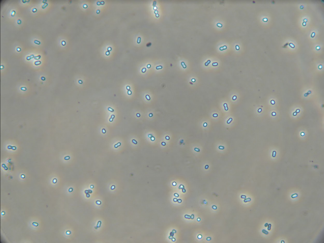
Image of ‘Hot Peanuts’ under 400X magnification before S-layer removal. It phases bright because of the reflection of light off of the S-layer.
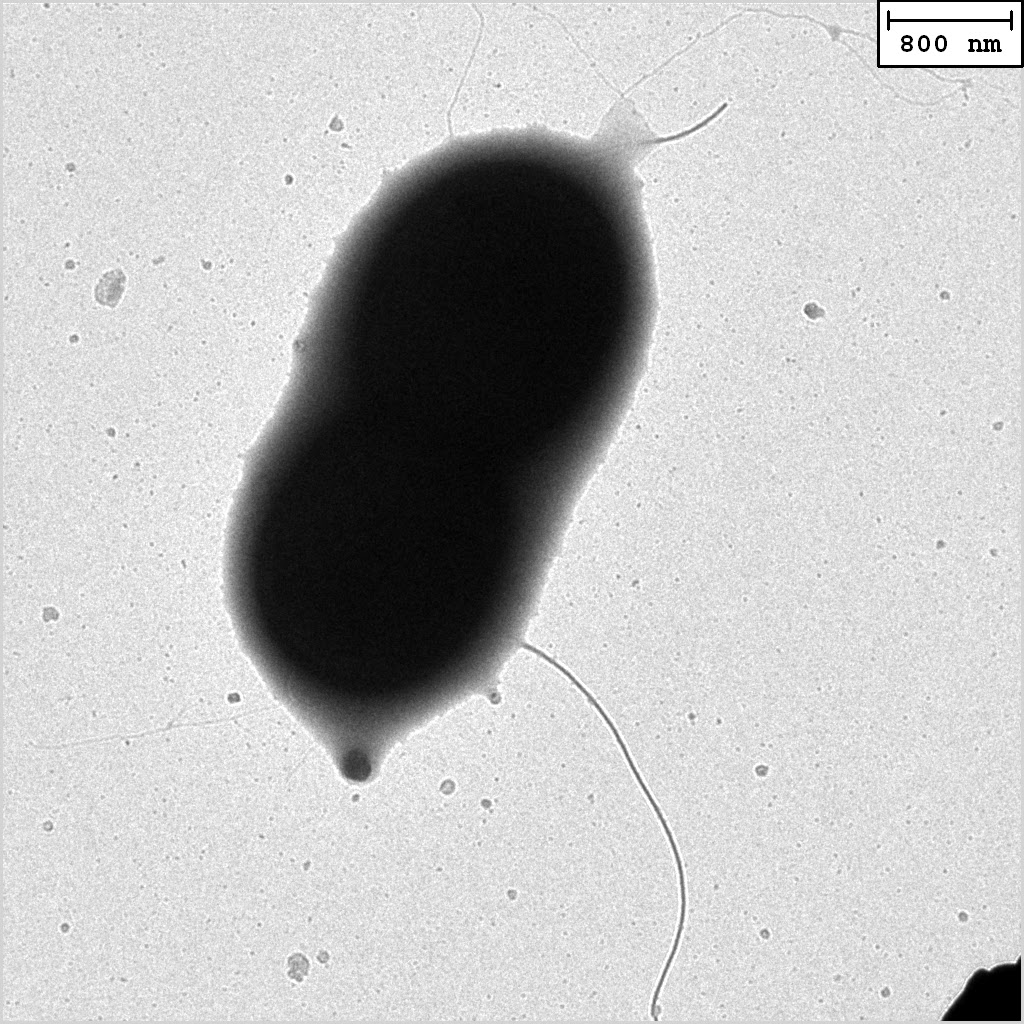
A close-up TEM image of a ‘Hot Peanut’
As part of their analysis, the researchers wanted to know the pattern and size of the S-layer subunits. To do this, they took a transmission electron microscopy (TEM) on a ‘Hot Peanut’ sample stained with tungsten at Boston University, and attempted to do FFT analysis on the image to discern its dominant periodic patterns.
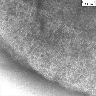
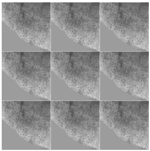
400x400 pixel TEM image of the S-layer pattern on the surface of a ‘Hot Peanut’.
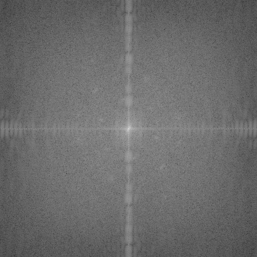
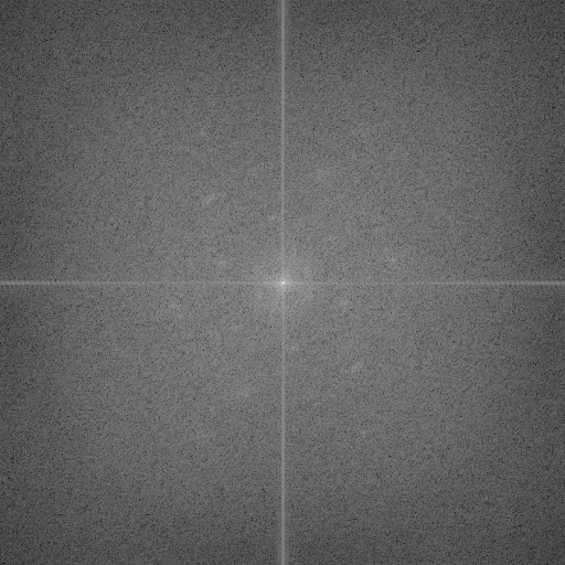
First attempt at a FFT. Only magnitude information is shown. Two hexagonal-shaped rings are barely visible. There is strong, unexplained noise along the vertical and horizontal.
From their FFT magnitude plot, the 2015-2016 research group could tell that their S-layer was probably hexagonal, but they held back on publishing because their FFT plot looked unusually messy and they did not know how to read size information from the magnitude plot.
Fortunately, I figured it out. See my post on 1D and 2D Fourier Transforms to learn more about the basic concepts (magnitude, phase, shifting, log transforms). The rest of this blog post will use the bacteria S-layer as a case-study for performing image analysis with Fourier Transforms.
2 INTRO TO BACTERIA S-LAYERS
Most prokaryotic cells are encapsulated by a surface layer (S-layer) consisting of repeating units of S-layer proteins. These S-layers protect cells from the outside, provide mechanical stability, and play roles in spreading disease.
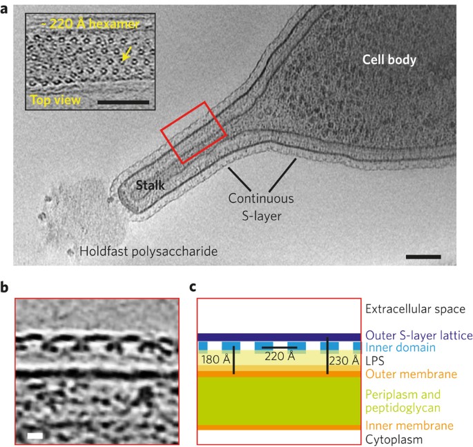
Image source: Structure of the hexagonal surface layer on Caulobacter crescentus cells
The S-layer arrangement has a pattern of lattice symmetry with a center-to-center subunit spacing ranging from 3 to 35 nm. The patterns are named by the number of monomers involved to make a repeating unit. The most common is hexagonal symmetry (p3, p6), but oblique (p1, p2) and square symmetry (p4) have been observed as well.
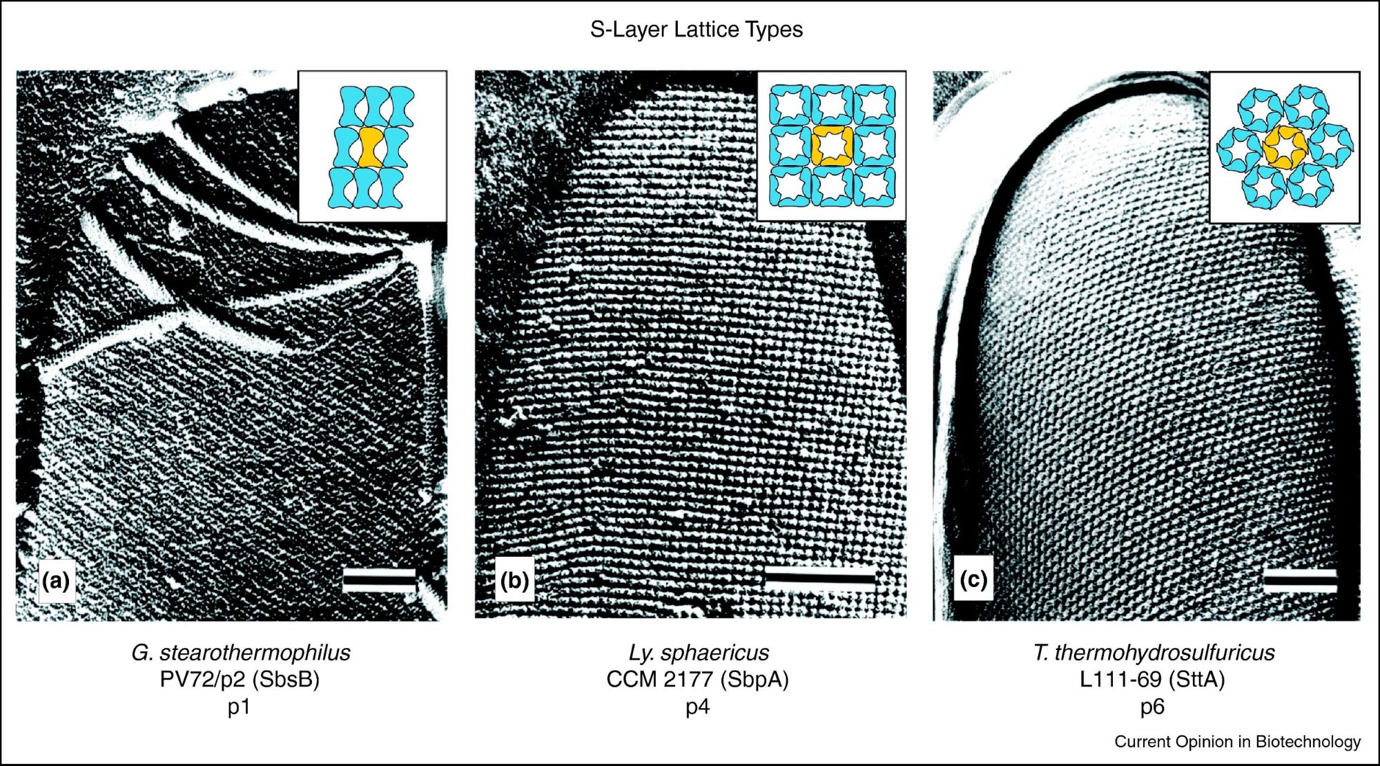
Image source: S-layer fusion proteins–construction principles and applications
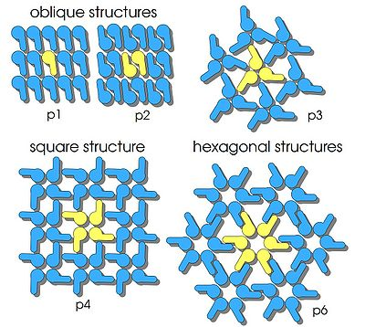
Image source: International Genetically Engineered Machine (iGEM) Team Bielefeld-Germany S-Layer
3 FFT WITH PYTHON CODE
Packages used in analysis:
import matplotlib.pyplot as plt
import numpy as np
from scipy.fftpack import fft2, fftshift, ifft2, ifftshift
from skimage import img_as_float
from skimage.color import rgb2gray
from skimage.filters import window
How to get image, image’s DFT magnitude plot, and log transformed magnitude plot:
## image
image = img_as_float(plt.imread("2A.tif"))
## take 2D DFT, center it, and get magnitude
image_f = np.abs(fftshift(fft2(image)))
## log transform to compress big values into smaller range
## lets us see more information in the magnitude plot
image_f_log = np.log(1 + image_f)
4 CLEANING AND INTERPRETING THE 2D FFT
Step 1. Remove Vertical and Horizontal Pattern Noise
When the FFT algorithm looks at an image, it assumes the image is one period of an infinitely repeating spectrum:
Bacteria S-layer TEM image with sources of horizontal and vertical periodic pattern identified.
The vertical and horizontal leakage is caused by discontinuities at the seams where the images join. The patterns are caused by the edge and shadows where the bacteria and the white background meet, and the sharp white box of the scale. We don’t care about these artificial patterns. Covering these areas with a uniform neutral grey color reduces the magnitude of the noise frequencies.
What the infinite spectra looks like when I color over the background and the white scale box.
FFT of colored-over image. The spectral patterns caused by patterns in the background and the sharp white box have been muted.
The edge mismatches at the seams of the images still produce sharp horizontal and vertical periodic patterns that the FFT picks up on, but overall the noise has gone down and the hexagonal rings are more evident.
To reduce the frequencies of the edge discontinuities, I can use a windowing function. Windowing smoothly reduces the amplitude of the signal as it reaches the edges, removing the effect of the artificial discontinuity from the FFT. I use the Hann windowing function in this analysis.
## windowed image
wimage = image * window('hann', image.shape)
wimage_f = np.abs(fftshift(fft2(wimage)))
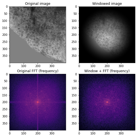
Right: original colored image and its FFT (magma color scheme to accentuate pattern). Left: Hann windowed image and its log magnitude FFT which has no edge discontinuities.
Step 2. Identify Key Periodic Frequencies
The FFT magnitude plot clearly shows two hexagonal rings of bright points:
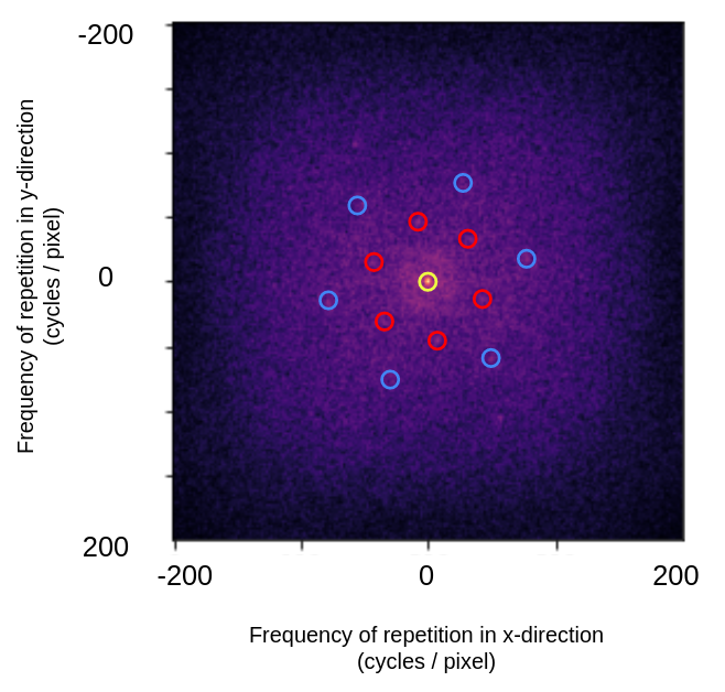
Annotated centered FFT log of magnitude plot. The yellow circle shows the DC-offset, or the average pixel brightness of the image. The red circles show the dominant lower frequency periodic pattern, the blue circles show the dominant higher frequency periodic pattern.
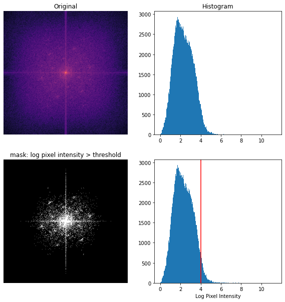
To identify the key frequencies I need to find the distance from the brightest points of the log magnitude plot to the center of the plot. I threshold by log of pixel intensity to create a mask of dominant frequency points (keep points with a log pixel intensity greater than 4).
thresh_min = 4
binary_min = np.log(1 + wimage_f) > thresh_min
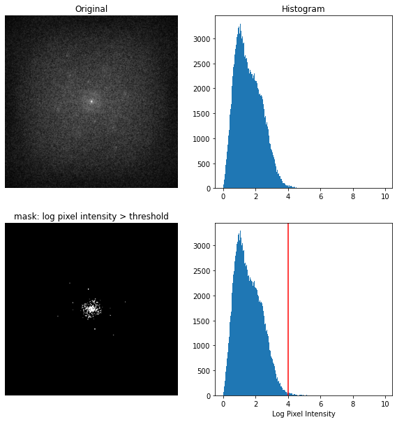
Top: windowed image centered log magnitude FFT and histogram of pixel intensities. Bottom: Mask keeping only pixels with log pixel intensity > 4 and annotated histogram
The mask contains some points from the inner and outer rings, as well as lower frequency points that are not important. I can use the mask to find how far the dominant frequency points are from the center of the plot.
def get_distance_matrix(N):
    x = np.linspace(-N/2, N/2, N)
    y = np.linspace(-N/2, N/2, N)
    X, Y = np.meshgrid(x, y)
    distMat = np.sqrt((X**2) + (Y**2))
    return distMat

distMat = get_distance_matrix(400)
distances = binary_min * distMat
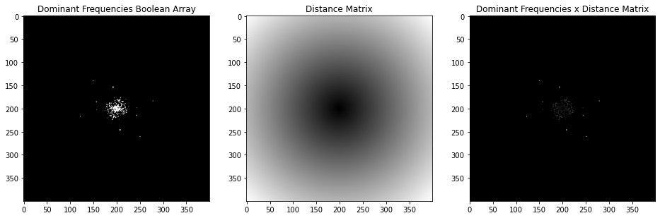
Result of multiplying mask by distance 400x400 pixel distance matrix.
Then I can simply sort the result, select ranges of similar values, and I have the distances for the points in the rings!
Inner Ring (Low Frequency Ring) (Red)
* number of points in mask: 20
* mean distance: 46.11 pixels
* standard deviation: 1.39 pixels

Outer Ring (High Frequency Ring) (Blue)
* number of points in mask: 8
* mean distance: 79.27 pixels
* standard deviation: 0.90 pixels
The Nyquist frequency is 0.5 cycles / pixel (the highest frequency pattern I can pick up on, i.e. if the pattern alternated each pixel). So the normalized range of possible frequency basis in the FFT goes from -0.5 to +0.5 cycles / pixel. Since our image shape is 400x400 pixels, each pixel in the frequency domain represents 1/400 cycles per pixel. Thus, I divide the frequencies by a constant 400 to normalize them to the unit scale.
Inner Ring (Low Frequency Ring) (Red)
* normalized average frequency: 0.115 cycles / pixel

Outer Ring (High Frequency Ring) (Blue)
* normalized average frequency: 0.198 cycles / pixel
Step 3. Calculate Size and Scale
From the normalized average frequency, I can find the period length of one cycle:
Inner Ring (Low Frequency Ring) (Red)
* average cycle length: 8.67 pixels

Outer Ring (High Frequency Ring) (Blue)
* average cycle length: 5.04 pixels
The inner (red) ring has a longer period, compared to the outer (blue) ring. This is expected, as the inner ring is closer to the center and therefore has a lower frequency.
Finally, I have to convert from pixels to nanometers using the scale on the original image.
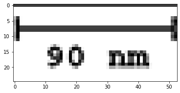
Scale on the original image. The scale is 53 pixels equals 90 nm.
Inner Ring (Low Frequency Ring) (Red)
* average cycle length: 14.7 nm

Outer Ring (High Frequency Ring) (Blue)
* average cycle length: 8.5 nm
These cycle lengths map to the dominant periodic frequencies in a hexagonal pattern!
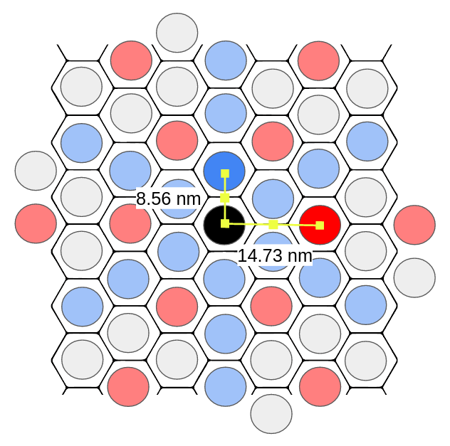
The annotated dominant patterns with their periods.
As a quick check, we verify the 8.5 nm and 14.7 nm periods are consistent with the ratios expected in a hexagon pattern. We can see the periods make up the legs of a 30-60-90 right triangle, so if the shorter leg is $a = 8.5$, we expect the longer leg to be $a\sqrt(3) ~= 14.72$. This looks good!
We can get our center-to-center spacing by multiplying the period length by 2:
Inner Ring (Low Frequency Ring) (Red)
* center-to-center spacing: 29.4 nm

Outer Ring (High Frequency Ring) (Blue)
* center-to-center spacing: 17.0 nm
Step 4. Identify Shape
The Fourier magnitude plot pretty clearly shows two hexagonal rings. Lets compare the layout to the example S-layer images from earlier in the post:
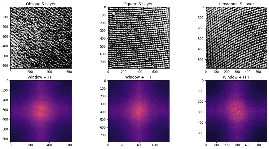
FFT log magnitude plots of example oblique, square, and hexagonal S-layers
Here, I cropped the images, multiplied them with the Hann windowing function, and plotted their log of centered FFT magnitude plots. The magnitude plots are quite distinct: oblique S-layer has a dominant slant, square S-layer has a repeating grid of squares, and the hexagonal S-layer has hexagonal rings.
The Hot Peanut magnitude plot has the same layout as the example hexagonal S-layer!
Bonus: Visualize the S-Layer Units
I thought it might be cool to visualize the S-layer units.
I use the threshold logic from earlier to get a pixel intensity cutoff to isolate the key frequencies. This time, I am using a non-windowed image because when I inverse FFT, I want the result to have edges.
Top: colored-over image centered log magnitude FFT and histogram of pixel intensities. Bottom: Mask keeping only pixels with log pixel intensity > 4 and annotated histogram
The resulting mask can be used as a filter. I multiply the original FFT by it, then perform de-centering and inverse FFT.
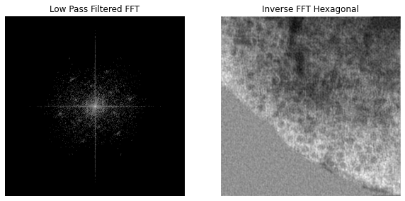
Filtered FFT and resulting inverse FFT
The resulting filtered image has hexagonal features! If I manually measure the center-to-center subunit distance along both of the key hexagonal frequencies, I get 16.24 nm and 29.6 nm. That is pretty close to the calculated center-to-center spacings! The error margin can be attributed to human error when trying to estimate the center of hexagons.
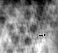
Close up of filtered reconstruction. Manually measured subunit center-to-center distance of 16.24 nm along periodic frequency of the blue ring (higher frequency).
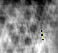
Close up of filtered reconstruction. Manually measured subunit center-to-center distance of 29.60 nm along periodic frequency of the red ring (lower frequency).
I can see what I filtered out by inverting the mask and doing the same inverse FFT reconstruction process. I have used an orange color map to display the faint noise more clearly.
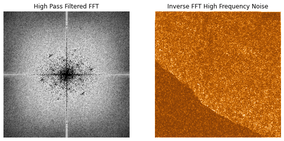
Inverted filtered FFT and resulting inverse FFT.
5 CONCLUSION
The 2D discrete Fast Fourier plot is a nice tool for picking out key periodic frequencies in an image. By using FFT analysis, I determined that the ‘Hot Peanuts’ bacteria S-layer had a hexagonal lattice pattern, and center-to-center subunit spacings of 29.4 nm and 17.0 nm.
This analysis was verified by comparing the ‘Hot Peanut’ FFT lattice pattern to known S-layer FFT patterns and by manually measuring the center-to-center spacing of the hexagonal subunits in a ‘Hot Peanut’ low-pass filtered spatial reconstruction.